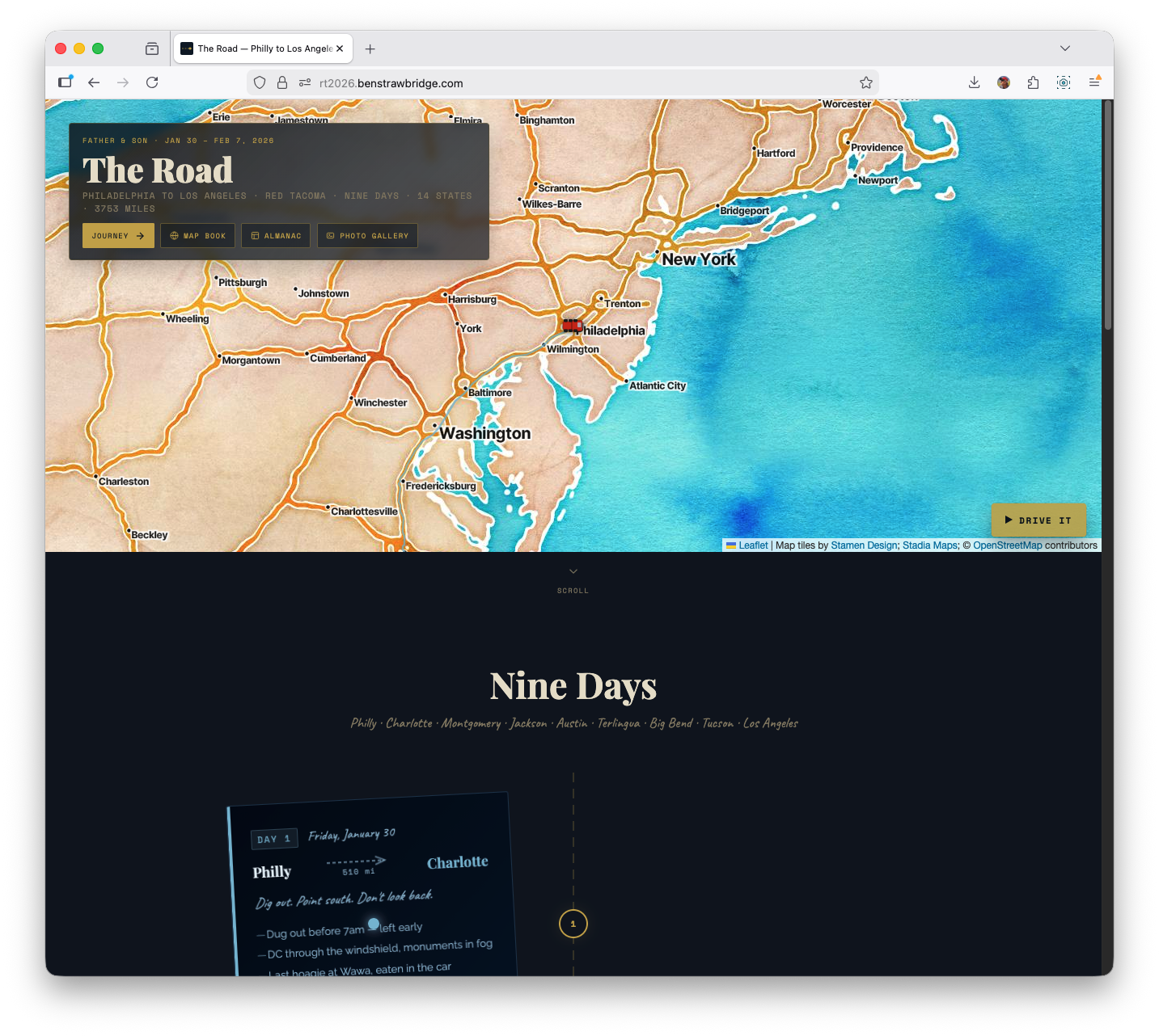
In late January and early February 2026, my dad and I drove my 2008 Toyota Tacoma from Philadelphia to Los Angeles. The trip took 9 days. The odometer read 3,753 miles at the end; the day-by-day mapped dataset sums to 3,572 miles. I started this as a journal project, but as soon as I imported the GPX tracks it became a data project: route structure, speed regimes, and elevation signatures that are hard to capture in prose alone.
This post is a technical record of how the site was built, what data pipeline choices held up, which map experiments failed, and what changed once performance constraints became real.
The production site is static Astro. No server rendering, no backend, no paid APIs, no framework runtime in the browser. That constraint set shaped almost every decision.
Project constraints and why they matter
When people say “static site,” they often mean content-only. This project was static, but highly interactive in the browser. That combination forced discipline.
The hard constraints were:
- Build target: static HTML/CSS/JS only
- Mapping stack: CDN-loaded libraries only
- Data source: Garmin GPX exports (one file per day)
- API requirements: no paid map keys
- Runtime: vanilla JS, no React/Vue layer around the maps
The important Astro-specific gotcha was script loading order. On standalone map pages, Astro/Vite can hoist and module-transform scripts in ways that break dependency timing with CDN globals. In practice that showed up as Leaflet pages throwing L is not defined at runtime when code executed before Leaflet was available.
The fix was straightforward but non-negotiable: every script tag that depended on CDN globals used is:inline so execution order matched document order.
That one detail turned a fragile setup into a stable one.
The source data: nine GPX tracks, uneven quality
The trip data is nine GPX files stored under public/maps, one per day. File sizes range from a few hundred KB to roughly 2 MB. Day 8 is the largest file due to a long desert leg and dense point capture.
Daily mileage in the working dataset (src/data/days.ts):
- Day 1: 510 mi (Philadelphia to Charlotte)
- Day 2: 400 mi (Charlotte to Montgomery)
- Day 3: 245 mi (Montgomery to Jackson)
- Day 4: 550 mi (Jackson to Austin)
- Day 5: 487 mi (Austin to Terlingua)
- Day 6: 121 mi (Big Bend local driving)
- Day 7: 133 mi (Big Bend local driving)
- Day 8: 636 mi (Terlingua to Tucson)
- Day 9: 490 mi (Tucson to Los Angeles)
Dataset total (sum of daily miles): 3,572 miles. Odometer total (Day 9 photo): 3,753 miles.
One of the first lessons was that “GPX” does not mean “clean.” Raw files include realistic variation plus noise:
- Occasional coordinate anomalies
- Elevation jitter, especially in urban/highway segments
- Outlier speed deltas from GPS jumps
- One incorrect Day 2 GPX file in an early iteration (wrong region data) that had to be replaced
A map can absorb this noise visually. Derived charts and animations cannot. That forced a deliberate preprocessing pipeline.
Library selection: practical over fashionable
For interactive maps, Leaflet 1.9.4 was the right choice by a wide margin. The alternatives were either too heavy for the constraints or unnecessary for the problem.
Why Leaflet won:
- Small payload relative to WebGL-first libraries
- Mature plugin ecosystem
- Easy raster tile integration
leaflet-gpxsupport for quick route rendering and bounds handling
For data visualization, D3 v7 UMD was the best fit for custom SVG output. The project needed precise control over line generation, area fills, scales, interaction hit-testing, and rendering order. D3 handled all of it without introducing a framework dependency.
The “CDN-only” policy might sound limiting, but it helped. It pushed the code toward composable primitives and avoided toolchain complexity for map pages. I specifically skipped MapLibre GL and deck.gl for this project because their payload and complexity were overkill for static, raster-tile GPX rendering.
Tile provider experiments
A dedicated style comparison page was built to evaluate tile providers against the same route geometry. The test case was Day 1 at multi-state zoom levels where readability is difficult.
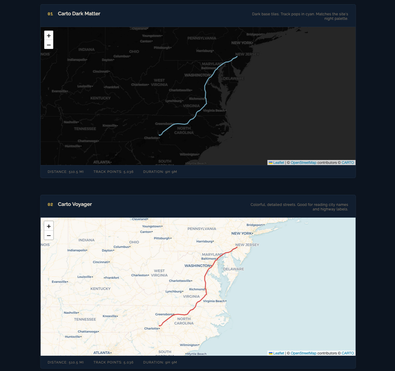
Providers evaluated:
- Carto Voyager
- Carto Dark Matter
- Carto Positron
- OpenTopoMap
- Stadia Watercolor
- Stadia Toner
- ESRI NatGeo
- ESRI Satellite
Key findings:
- Voyager was the best default for narrative route context. Road hierarchy and labels held up at zoom 5-7.
- Dark Matter was best for high-contrast overlays like speed segmentation.
- Watercolor looked great in static screenshots but was slower and less predictable in tile responsiveness.
- Some providers do not support subdomain rotation. Assuming
{s}works everywhere is a mistake.
Resulting standard:
- Use Carto Voyager for overview and linked elevation views.
- Use Carto Dark Matter for dense colored overlays.
- Keep stylized providers as optional experiments, not defaults.
- For the homepage hero, I still chose a watercolor basemap for artistic tone over strict cartographic clarity.
Data pipeline: from GPX to usable geometry
For basic trip maps, leaflet-gpx handles parsing and layer lifecycle. For analytical views (speed, profiles, ridge), raw point-level control was required.
The manual parse pipeline:
fetch()GPX fileDOMParserto XML- Extract
trkptnodes into point objects - Build derived series with distance/elevation/time
Representative point schema:
latlonele(meters)time(when needed)
Then a second-stage transform:
- Convert elevation to feet for readability
- Compute cumulative distance via Haversine between adjacent points
- Smooth elevation with rolling average
- Downsample where required
Why smoothing happens before downsampling
Raw GPS elevation is noisy. If you downsample first, your selected points can lock onto noise and preserve the wrong structure. Smoothing first produces a cleaner signal, then downsampling preserves real shape rather than measurement jitter.
The pipeline used a 5- to 6-point symmetric rolling average depending on the visualization.
LTTB vs stride sampling
Two downsampling strategies were used deliberately:
- Stride sampling (every Nth point): fast, acceptable for map overlays and simple profiles
- LTTB (Largest Triangle Three Buckets): better shape preservation for charts where peaks and inflections matter
LTTB reduced large track series to around 480 points per profile while retaining meaningful contour. It is a clear quality upgrade over naive stride sampling for elevation graphics.
Full trip map: multi-layer architecture and interaction
The full overview map renders each day as its own polyline layer with a consistent theme color. This design choice was essential: day-level interactivity is impossible if everything is merged into a single polyline.
Interaction model:
- Hover a route segment -> highlight corresponding day row in sidebar
- Click route segment -> fit map bounds to that day
- Click sidebar row -> same focus behavior
- Track load counter increments as GPX layers resolve
Layer lifecycle details:
- Each day layer loads async
- On layer
loaded, day bounds are captured - Combined bounds are computed after all nine are present
- Final
fitBoundsoccurs once complete
This avoids early “jumping map” behavior and ensures initial framing is based on the full trip footprint.
The map itself is not analytically deep, but it became the control surface for the more data-dense pages.
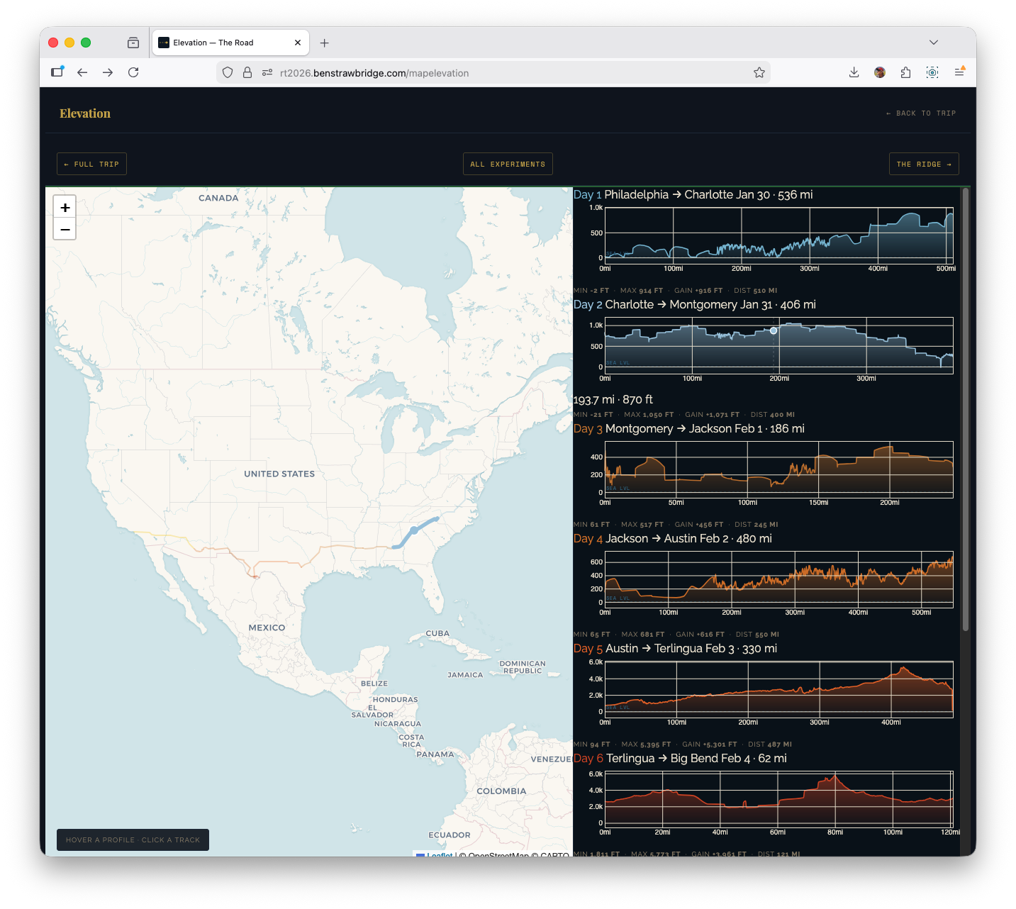
Elevation page: linked map + profile system
The elevation page uses a split layout: map on the left, nine profile cards on the right. This was a UX decision driven by analysis flow.
Stacked vertical layouts force the user to scroll between geography and profile context. Side-by-side keeps both visible, which makes pattern recognition much faster.
Technical composition:
- Leaflet for route context
- D3 for per-day elevation profiles
- Cross-linked hover and focus states between both sides
Per-day processing flow:
- Parse GPX
- Smooth elevation
- Compute cumulative distance
- LTTB downsample for chart rendering
- Render D3 area+line profile
- Register interaction handlers
Interaction details:
- Hover profile card -> route highlight on map + moving marker
- Hover map route -> corresponding profile card highlight
- Click map route -> scroll profile card into view
This required a shared active-state system so both map layers and DOM cards could synchronize state transitions without flicker.
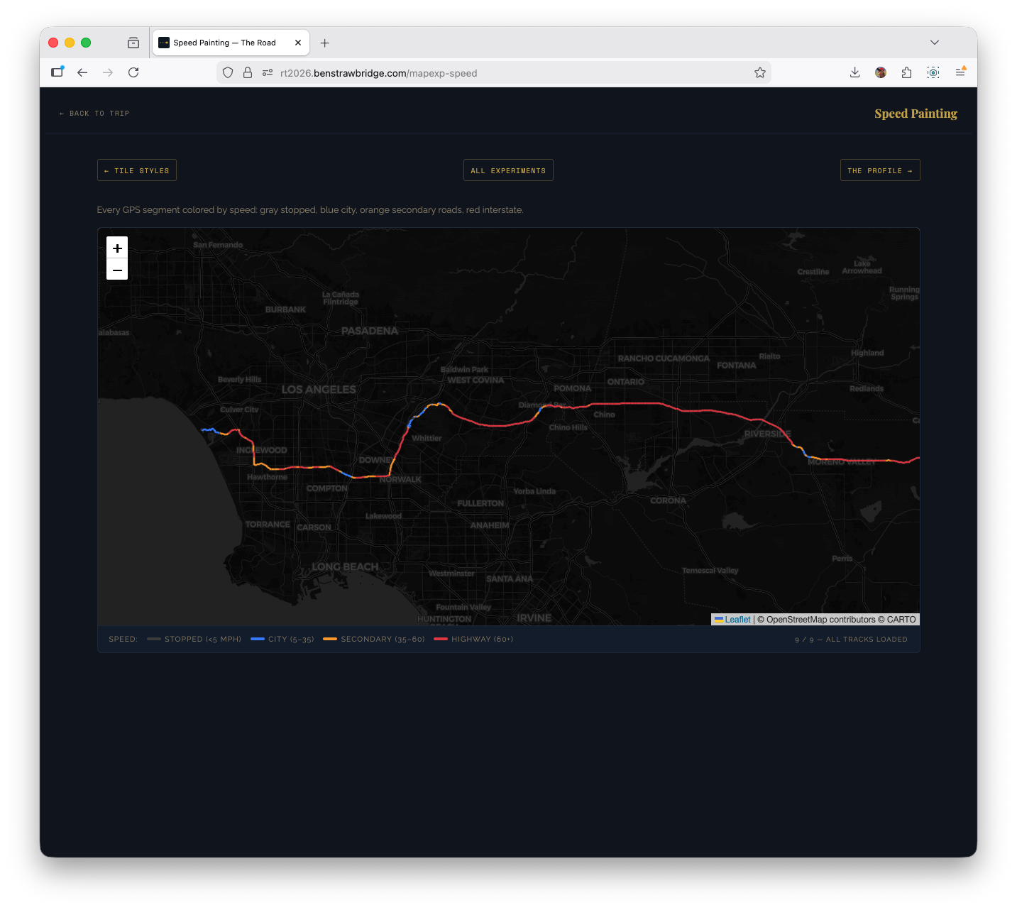
Speed painting: segment-level classification
The speed experiment discards day-level aggregation and classifies individual segments by estimated mph. It parses points directly and computes segment speed from distance and time delta.
Speed buckets used:
- < 5 mph: stopped/parked behavior
- 5-35 mph: urban/secondary roads
- 35-60 mph: transition roads and slower highways
- 60+ mph: interstate cruise segments
Each segment is drawn as its own polyline with bucket color.
Important practical guardrail: speed cap at 90 mph. Without a cap, single GPS glitches produce impossible spikes that dominate color scales and mislead interpretation.
Why this view was useful:
- It exposed interstate cadence versus local driving at a glance.
- Big Bend days became instantly distinct from transit days.
- End-of-day metro approaches showed up as dense low-speed tangles.
This is one of the few experiments where a map-native representation is clearly better than a chart.
Replay experiment: performance bottleneck and fix
The replay page animates trip progression point-by-point with a moving truck marker. Initial implementation rebuilt polylines every frame by removing and recreating layers.
That approach failed at scale.
Problem characteristics:
- Tens of thousands of points across all days
- Rebuilding the entire visible route every frame (O(n) layer churn)
- Browser main thread overloaded
- Animation duration and frame pacing unacceptable
Fix strategy:
- Precreate polyline objects once
- Update existing geometry in place using
setLatLngs() - Pre-sample tracks aggressively for animation purposes
After sampling to a few hundred points per day, replay became viable with multiple speed modes:
- Smooth: geographic fidelity, slow progression
- Fast: practical default
- Warp: compressed coast-to-coast
- Instant: draw all at once
A follow-mode toggle (panTo each frame vs fixed national view) made the feature usable both as animation and as quick summary.
This was the clearest case where data resolution needed to be purpose-specific. The point density needed for archival truth is not the density needed for an animation interface.
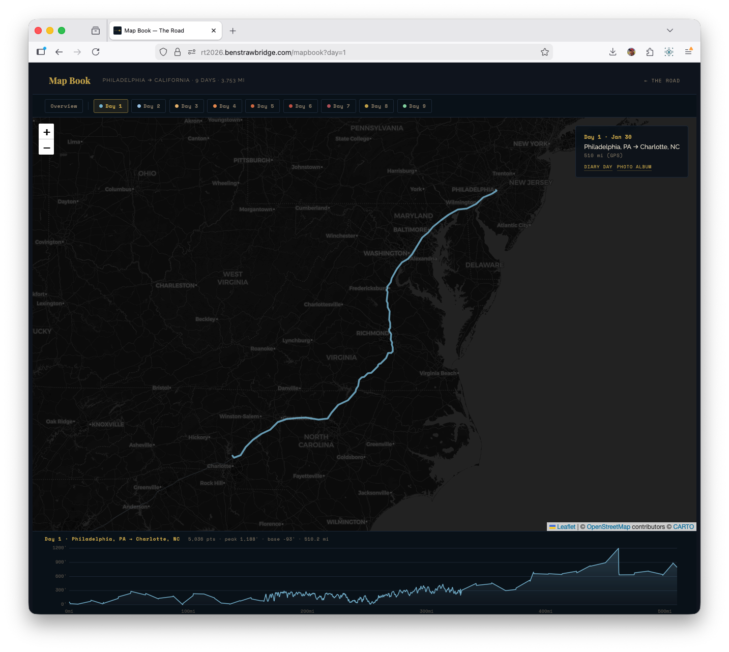
Map Book: the integrated final interface
The experiments were useful, but the shipped synthesis is Map Book: one interface that combines trip overview, day-level focus, and on-demand elevation context.
The key behavior is mode-switching by selection state:
- Overview mode (
/mapbook): all days visible, elevation panel closed - Day mode (
/mapbook?day=1through?day=9): map zooms to the selected day, non-selected tracks dim, and the elevation panel opens for that day
That made the interface much cleaner than splitting everything across separate experiment pages. You can start broad, pick a day, inspect its elevation shape, then move day-to-day from the same surface.
Under the hood, Map Book also supports deep-linking: selecting a day writes ?day=n to the URL, so a focused view can be shared directly.
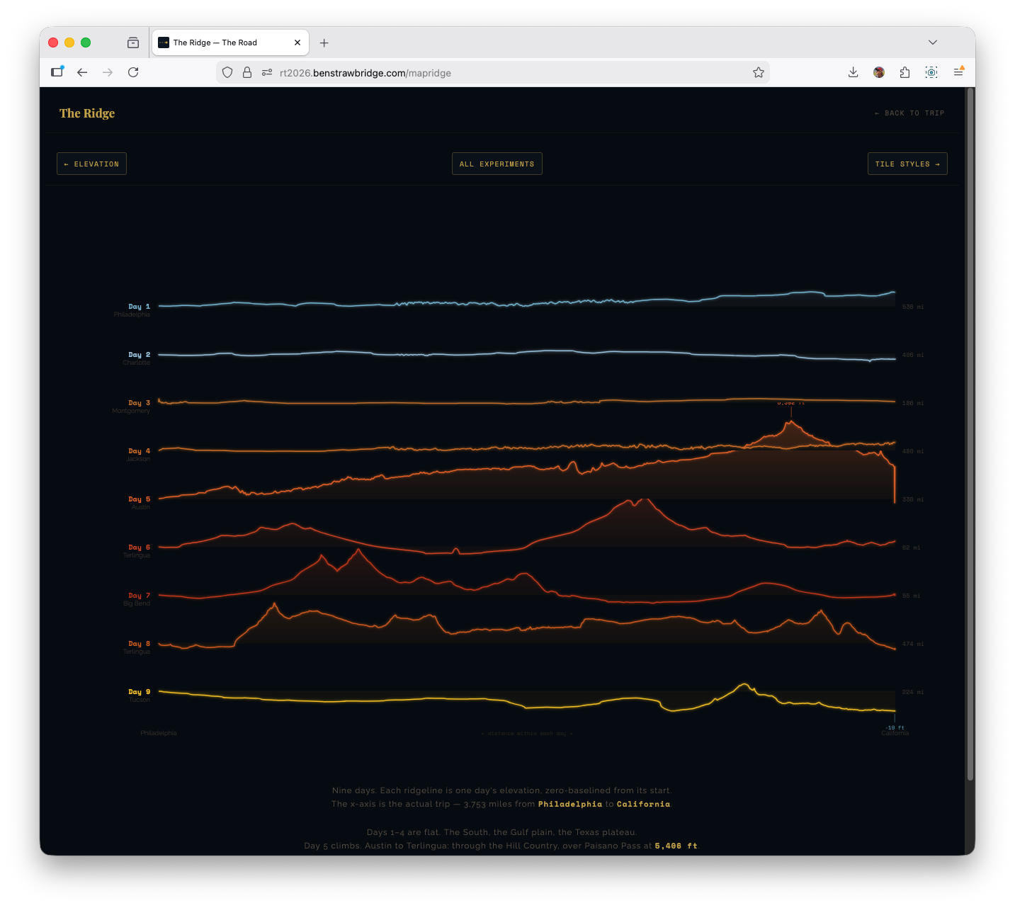
Ridge plot: two bugs that changed the implementation
The ridge visualization was directly inspired by Joy Division’s Unknown Pleasures cover and its stacked waveform/ridgeline aesthetic. It looked straightforward in concept and was deceptively tricky in execution.
Bug 1: row fill masking all lower rows
Each ridge row used an area fill. The first implementation filled from line to full SVG bottom (y0 = SVG_H). That caused top-rendered rows to visually wipe out lower rows.
Fix: fill each row to its own baseline (y0 = baseline) instead of full canvas height.
That single coordinate change restored proper layered visibility.
Bug 2: baseline drift from single linear scale
Using one linear scale over mixed positive/negative relative elevation caused the zero point to drift when positive and negative extrema were asymmetric. Flat days no longer sat on baseline.
Fix: diverging scale logic anchored at zero:
- One scale for positive gain
- One scale for negative drop
- Both share baseline origin
Result: flat sections actually render flat at baseline, while gains and drops remain proportional.
This solved both visual correctness and interpretability.
What the data surfaced that narrative alone misses
A few patterns became obvious only after building the visualizations:
Day structure asymmetry Short park days (Days 6-7) and long transit days (Days 1, 4, 8) require different visual treatment. A single chart grammar for all days under-communicates both.
Elevation transition signature The Austin -> West Texas climb reads as a structural break in the trip. It is the moment when terrain behavior changes for the remainder of the route.
Below-sea-level corridor on Day 9 The Salton Sea dip appears as a real trough in cleaned data, not a random glitch.
Speed regime contrast Interstate and park-road driving are separable without labels once speed segmentation is colorized.
Noise placement GPS and elevation anomalies cluster in predictable environments (dense urban corridors, overpasses, constrained sky view), which informs where smoothing and clipping should be strict.
These are precisely the kinds of patterns a standard photo journal cannot preserve.
Build and maintenance decisions that reduced long-term risk
Several choices were intentionally conservative:
- Static deployment with no backend dependencies
- Minimal runtime JS on non-map pages
- CDN-hosted, well-understood libraries
- Plain XML parsing instead of bespoke GPX tooling stack
- Explicit, readable transform pipeline
That gives the project good durability. The site can remain readable even if part of the experiment surface eventually changes.
If I expand this further, the next experiments are:
- Shared GPX processing helpers so all map pages use one parsing/smoothing/downsampling path.
- Photo geotag overlays where EXIF coordinates exist, so route and gallery can be read together.
Why this article exists
A personal road trip generated a usable geospatial dataset, and a static-site stack was enough to turn it into multiple coherent map views. The quality gains came from small technical choices: script loading order, smoothing order, downsampling method, and interaction architecture.
That was the point worth writing down.